Saturday, April 28, 2012

...Speaking of Cobain,

Some things are just timeless: as relevant  as when they first came out. Some great examples of this include George Orwell's 1984, the stand-up acts of Bill Hicks or George Carlin, and this cover for Nirvana's second studio album, Nevermind.

The balance and art direction are great, but I think at the end of the day, for a design to have a great amount of impact and staying power it needs to have a great message. The message here is quite clear; it is an image of humankind, and how we're distracted and lured in by material goals to the exclusion of the important things in life. I don't think this issue will ever cease to be relevant, unless we all wake up one day to find that worldwide corporations have stopped polluting and exploiting and making wars for profit, and have instead decided to focus on feeding the hungry.

...Or something like that. It's a timeless and thought-provoking message, which is why Nirvana is as popular with angsty teenagers today as it ever was.


Friday, April 27, 2012

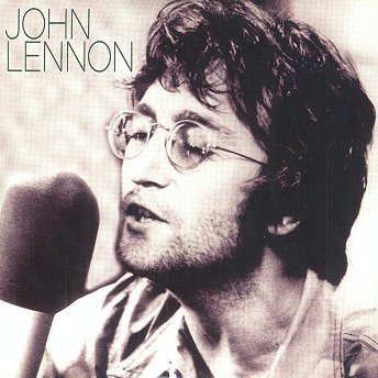
Let's go retro: John Lennon

For me, sometimes the classics really are the best... And it doesn't get much better than John Lennon. The art direction is genius for this cover; so simple... Nothing but John Lennon singing. I think when it's someone as iconic as he, you really don't need much more than that; some of the greatest imges from music are just the artist's portrait, looking human and being themselves. I'll take iconic imagery like this John Lennon piece or Kurt Cobain's famous shoot(below) over a half-naked woman in 10lbs of makeup or a guy looking pretentious and trendy any day.

Listen to me, eh? Any day now I'll probably start rambling on about
"You damn kids with your music... Skateboarding on the sidewalk... No respect.."

But what can I say? Sometimes the older stuff really is the best. I'd wager anything by Lady Gaga or Katy Perry will be long forgotten a decade from now; but we'll still be enjoying songs like "Come Together" and "Smells Like Teen Spirit" long long after.


John Lennon album cover


If you don't know who this is just give up now.

Nine Inch Nails: The Downward Spiral

Trent Reznor was one of my favourite artists growing up... And Nine Inch Nails' The Downward Spiral, in my opinion, his greatest album. Here we see another tactile piece: a perfect blend of fading and decay. This says much about the album itelf, which has common themes like self destruction, hurt, anger and loathing... (Basically the perfect blend of angry angsty rock, if you're a teenager.)

The text is small, but powerful; dynamic above a big brown spot.

Awesome album and awesome cover.


The Yeah Yeah Yeahs: Show Your Bones

Here's a really neat tactile album cover from the yeah yeah yeahs. While the design itself is perfectly centered, the grain and imperfections of the material make it really visually interesting. Even the colours follow this same rule; all primary colours that make it look perfectly balanced, but with enough shadow and areas of muted colour to keep things dynamic.

Really awesome cover.


The Yeah Yeah Yeahs: Show Your Bones

Christina Aguilera- Bi On Ic

I think this is a really well designed cd cover. Its something really difference that you havent quite seen before. I love the white space that has been left there. It really makes you focus on the initial image. The only problem I have with this cover, is the font used. I don't  find that it really is fitting for this piece.

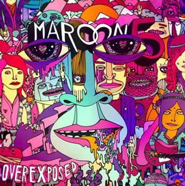
Maroon 5-Overexposed

This cd cover, is very overwhelming. The only positive I can give it is that the colour scheme really comes together as a family, and isn't too hard to look at.

Lily Allen-The Fear

I usually prefer a cd cover that doesn't feature the artist. This was an interested way to promote it and Its a successful cover. The colours are great and very eye catching.

Mumford&Sons- Roll away your stone

Another great cd cover by Mumford & Sons. It consists of the same style of design. The colour is a muddy green, which is paired with a few different grays. The illustration is mind blowing.

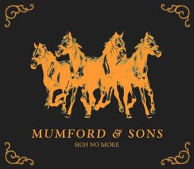
Mumford & Sons- Sigh No More

This is a beautiful cd cover. I love the use of burn yellow throughout it. The image is interesting and different, and the entire cd cover comes together as a family.

Tom Petty and the Heartbreakers-MOJO

This would be the opposite of a great red, white and black combination. I'm confused by the layout, and find that my eye is wondering all around the cd case. I think the bottom portion of the cd throws a viewer off.

ACDC- BLACK ICE

This cover is a great way of using black and red. The font texture is amazing, and really creates a visually appealing contrast. I love the image in the background, and how it is mostly outlined, and not filled. Its an eyecatching cd cover/

Libera

i really love roses but this one is one of kind it has meaning  the buttles around  each other
tells you the life is going and depending on the others and relaying to it has the life it is

FLY


i like this style of photography it's kinda Dreamy simple but it has lots of meaning  the vintage texture tells me the life experience  hat she has  and no matter what defalcates she get she still enjoying her life

Thursday, April 26, 2012

Im not dead


Pink !!Pink  i love her style its not my style tho but i adore her personality she is nutty ,but in this album cover it shows how much fun ,innocent , energetic withe a bit of sweet by adding the pegon .

Plans death cab for cutie


I do like this concept  neither its a tree nor splash of bold  it is combusting but it did not give the vower Creepy feeling it i really neat idea

On letting go


this hand drawing album cover really net idea how the head burn  lead the eye to the balloon
 show  very confuse, lost . to much busy  ends up by buying  i lie it  really to the point messge

A day withe out rain


I do  like this photography style  vintage feeling  withe stylish personalty  plus it's go well withe Enya song performers  and the title of the album cover  blinds well the photo its the feeling of dryness !!

Daydreamer Dialogue


I like this one and how they use typography as a  hair and the  heavy stain  colour give it bit of drama blinds well the eye look
for the songs lyrics and the album title ad tiara 

The velveteen as diane birch


This album cover has special feeling  it's bring back the black and white movies  and it's reflects  the music background 
i end it really  intersted   and romantic 

The very best of Enya


i find this dramatic both in colour and in content i love how her and her dress resumable as poppy
i and the font really represents her personality and her singing style