Hand-made typography can be a unique and effective design for any media, but for an album cover it can really help to bring out the artist's personality and style. Sometimes a computer-rendered font just isn't enough; sometimes a design just needs the extra personal touch of illustrative hand-made type. The best ones tend to be relatively simplistic... Nothing but the type; a solid background to contrast with the dynamic typographic design.
My first choice, by Cage the Elephant, appears to be a watercolour composition. The white background makes the busy type work; it is an excellent design.
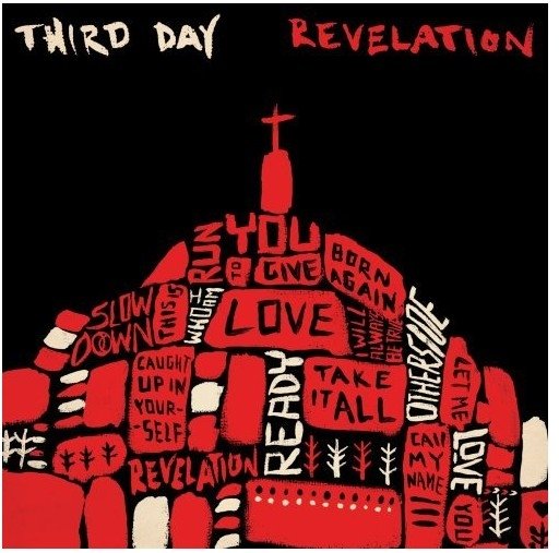
The second piece, by Third Day, uses a juxtaposition of planes of typography and colour. The black, red and white creates a dynamic and exciting visual energy in the shapes.
The third album is a compilation not just of songs but of various objects that come together to create the typography. The result is a tactile sensation that is visually appealing and extremely successful.
 |
| Cage The Elephant album cover: Thank You Happy Birthday |
 |
| Third Day album cover: Revelation |
 |
| Songs from the 20th Century Compilation album cover |


No comments:
Post a Comment