For my current Graphic Design project, I am taking a modern advertisement and bringing it back to a retro sixties style... So I thought perhaps I should take a moment to explore 60s record design here on the blog.
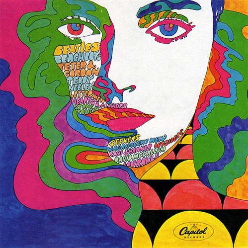
This Capitol Records cover could never be mistaken as anything but a 60s piece. The lines are beautiful and free, the colours are all over the place, and the tone is psychedelic in its sale of ideals such as free love, rock and roll, and music like the Beatles. One can imagine it being quite easy to go overboard with so much going on in the piece, but all in all it is balanced out masterfully; pieces of flat white and sections of flat colour contrasting nicely with the busier areas. Hints of the warhol-esque pop art exist, but all in all the piece is unique and engaging. The sort of wild typography which fits into all kinds of different shapes, free from constricting rules, is not just a symbol of the spirit of the age but also an ongoing theme in design of the era.

Here we see a peacock made up of colour and typography in a 1963 Victor Moscoso cover. Notice again the flat planes of intense colour, psychedelic typography, and the fact that the pieces combine to create a greater whole images that is almost abstract in its execution. All of these fit in nicely with the design themes of the free-loving era.
This Grateful Dead piece from Alton Kelley is also fitting in well with the previously mentioned themes, though at the same time we can see some definite influences from the era of art nouveau. This could perhaps be said of many 1960s design works. Take for example this piece by Alphonse Mucha from the late 1800s.
Art Nouveau or swinging 60s? Either way, it is clear that the era of psychedelic album cover/music poster design was very much influentially rooted in the beauty of Art Nouveau.


No comments:
Post a Comment